


If you are trying to understand where PFAS contamination is most severe, a good map can save hours of guesswork. It can also be the difference between reading a headline and spotting a real risk near your home, workplace, or water supply. PFAS contamination maps are now one of the most useful tools for tracking pollution hotspots, but not all maps are created equal. Some are highly local and data-rich; others are broad, outdated, or based on incomplete reporting.
So where should you look for the latest PFAS pollution hotspots, and how do you tell a credible map from a flashy one? That is the key question. The short answer: use maps built from verified sampling data, check the date of the latest update, and pay close attention to whether the source is a regulator, a research group, or a media project. The details matter, because PFAS contamination is rarely evenly distributed. It tends to cluster around industrial sites, airports, military bases, wastewater facilities, landfills, and places where PFAS-containing products have been used intensively.
Why PFAS contamination maps matter
PFAS are often called “forever chemicals” because they do not break down easily in the environment. Once released, they can move through soil, seep into groundwater, and spread through rivers, sediments, and even food chains. That mobility makes a map especially valuable: it helps show not just where PFAS was found, but where the contamination may be moving next.
For communities, maps can answer practical questions:
- Is my drinking water source affected?
- Are there known industrial or firefighting sources nearby?
- Has a local authority tested and published results?
- Are there trends showing pollution spreading over time?
For journalists, campaigners, and public health researchers, maps also reveal patterns. A single sample may matter, but a regional hotspot often tells a bigger story about how PFAS is being used, disposed of, or allowed to persist. That is why the best maps are more than static pins on a screen. They are evidence-based snapshots of an evolving pollution problem.
Where to find the latest PFAS pollution hotspots
If you want the freshest data, start with sources that update frequently and clearly state their methodology. In practice, the most useful PFAS contamination maps usually come from a few key groups.
Government and regulatory agencies are often the first place to check. In the UK, this means looking at the Environment Agency and relevant water company testing updates, as well as local authority announcements where available. In the United States, the EPA has become a central reference point, although state-level agencies often publish more detailed local results. Across Europe, national environment agencies and regional water authorities may publish site-specific findings, especially where remediation is underway.
Research-led map projects can be even more useful when you want a broad view. Academic initiatives sometimes compile public sampling results, industrial site data, and court records into searchable maps. These projects are often the best option when you are trying to identify emerging patterns, compare regions, or understand how PFAS contamination clusters around certain industries.
NGO and watchdog maps can also be valuable. Non-profit groups often highlight hotspots that receive less attention from regulators. They may focus on communities with legacy contamination, military firefighting foam use, or areas where drinking water standards are still being debated. The strongest NGO maps are transparent about source data and clearly separate confirmed measurements from suspected sources.
Media investigations are worth watching too, especially when they are built around leaked reports, court documents, or newly published datasets. These maps may be highly relevant for a specific time period, although they are sometimes less comprehensive than regulator-led tools. Useful? Yes. Complete? Not always.
The most reliable map types to look for
Not every PFAS map answers the same question. A map of known industrial discharge sites is useful, but it is not the same as a map of drinking water contamination. A map of firefighting foam use is not the same as a map of soil contamination. Before drawing any big conclusions, check what the map actually shows.
Here are the main types you will encounter:
- Sampling maps show measured PFAS levels in water, soil, sediment, or air.
- Source maps identify likely contamination sources such as factories, airports, or training bases.
- Exposure maps combine contamination data with population or water supply information.
- Risk maps rank areas using multiple indicators, which can be useful but depend heavily on the scoring method.
Sampling maps are usually the most defensible because they are based on actual measurements. Source maps are useful for spotting likely hotspots, but they do not always prove contamination has spread. Risk maps can be helpful for prioritising action, yet the criteria behind them should always be checked carefully. If a map cannot tell you where its numbers came from, it should not be treated like a final answer.
Hotspot patterns that keep appearing
Although PFAS contamination is geographically diverse, some hotspot patterns show up again and again. These are the places worth paying close attention to when scanning a map.
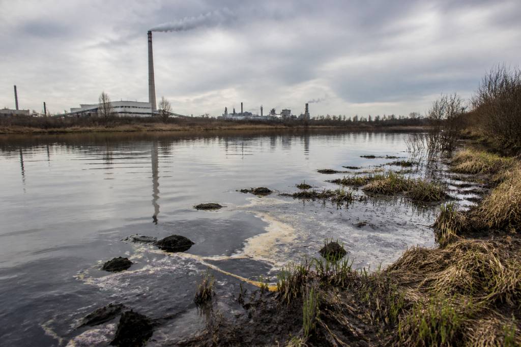
Industrial corridors are often high on the list. PFAS has been used in manufacturing processes linked to textiles, coatings, electronics, plating, packaging, and chemical production. Where these industries cluster, contamination often follows nearby rivers, groundwater aquifers, and wastewater discharge points.
Airports and military sites are another major hotspot category. Aqueous film-forming foam, or AFFF, has been widely used for fire suppression in aviation and defence settings. This has left a long tail of contamination at and around training grounds, runways, and former testing sites. The pattern is so common that if a map shows elevated PFAS near an airport, it is rarely a coincidence.
Wastewater treatment plants can also appear as hotspots because they receive PFAS from households, businesses, and industry, then often pass some of that contamination into sludge, effluent, or receiving waters. In some regions, land application of contaminated sludge has spread PFAS into farmland and surrounding soils. That is a reminder that “treated” does not always mean “removed.”
Landfills matter as well. PFAS-containing consumer products, industrial waste, and contaminated materials can leach into leachate and nearby groundwater. A map may show elevated levels downstream or down-gradient rather than directly on the landfill itself, which is one reason groundwater flow direction matters so much.
Fire-affected training areas and emergency response sites can appear on hotspot maps even when nearby communities have no obvious industrial source. PFAS use in firefighting foams has made these sites a recurring concern across many countries.
How to judge whether a PFAS map is trustworthy
A good PFAS contamination map should not just be visually appealing. It should be defensible. Before sharing a map or relying on it for a decision, ask a few basic questions.
- Who created the map?
- Is the source a regulator, university, NGO, or news outlet?
- When was it last updated?
- What type of samples were used?
- Were the data collected using consistent methods?
- Does the map show actual test results or only suspected sources?
- Are detection limits and units clearly explained?
These questions matter because PFAS datasets can be messy. One map may use results from drinking water samples measured in parts per trillion, while another compiles industrial discharge data in different units or with different detection thresholds. Compare them without reading the methodology, and you may end up comparing apples, oranges, and laboratory glassware.
Also watch for maps that do not distinguish between different PFAS compounds. A location with elevated PFOS is not identical to one with high PFOA, PFHxS, or shorter-chain PFAS. The toxicological profile, persistence, and movement through the environment can differ. That does not mean one is safe and another is not; it means the detail matters.
Where the newest data usually appears first
If you want to find the latest hotspots as soon as they emerge, the best approach is to watch several channels at once. New contamination data often appears first in one of these places:
- Regulatory notices and enforcement updates
- Water utility testing reports
- Academic publications and preprints
- Environmental NGO map dashboards
- Local or national investigative reporting
- Court filings, especially in contamination litigation
In practice, the quickest signals often come from litigation or journalism, while the most reliable confirmation comes later from official sampling. That is why it helps to treat PFAS map reading like detective work. One source gives you the clue, another gives you the evidence, and a third helps fill in the geography.
For readers in the UK, it is worth monitoring water company updates alongside regulatory announcements, especially where drinking water abstraction points or catchment areas may be affected. In the broader European context, national environment ministries and river basin authorities can provide important clues about surface water contamination and industrial discharge controls.
What to do if a hotspot appears near you
Seeing a PFAS hotspot on a map does not automatically mean your tap water is unsafe, but it does mean the issue deserves attention. A nearby hotspot can indicate a source area, a transport pathway, or a contamination plume that may take time to travel. If you live close to a mapped site, the next steps should be practical and evidence-based.
- Check whether your local water supplier publishes PFAS test results.
- Look for recent updates from environmental regulators or local authorities.
- Ask whether the hotspot is linked to groundwater, surface water, or soil.
- Find out whether the area has a known industrial, airport, or firefighting foam history.
- If needed, use a certified lab for home water testing rather than relying on assumptions.
If you are a resident, school, business owner, or land manager, mapping can also help with advocacy. A visual record of contamination often makes it easier to ask informed questions: Who tested this site? How often? Which compounds were found? Is remediation planned, and what does it actually involve?
Why hotspot maps are still only part of the picture
PFAS contamination maps are powerful, but they are not the whole story. A hotspot on a map may reflect a single sample, an old dataset, or a newly discovered plume. Conversely, a blank area may simply mean no one has looked hard enough yet. That is one of the uncomfortable truths about PFAS monitoring: absence of evidence is not evidence of absence.
Another limitation is timing. Contamination can change slowly, especially in groundwater systems. A map from last year may still be broadly useful, but it may not capture a new source, a remediation effort, or seasonal variation in water flow. In other words, maps are snapshots, not the film.
Still, when used carefully, they are one of the best tools we have for seeing where the PFAS problem is concentrated and where it may spread next. They help communities ask better questions, regulators target resources, and researchers identify patterns that would otherwise stay hidden in spreadsheets and lab reports.
If you are trying to track the latest pollution hotspots, start with verified sampling data, compare sources, and stay alert to updates from regulators, researchers, and investigative reporters. The map alone will not solve the problem, but it can tell you where to look next. And when it comes to PFAS, knowing where to look is often the first step toward meaningful action.